The graphic evolution of Intermedia IT
Posted on January 16, 2024 / Company

Stylish rebranding: Our talented team led by Guillermo Pomeranz.
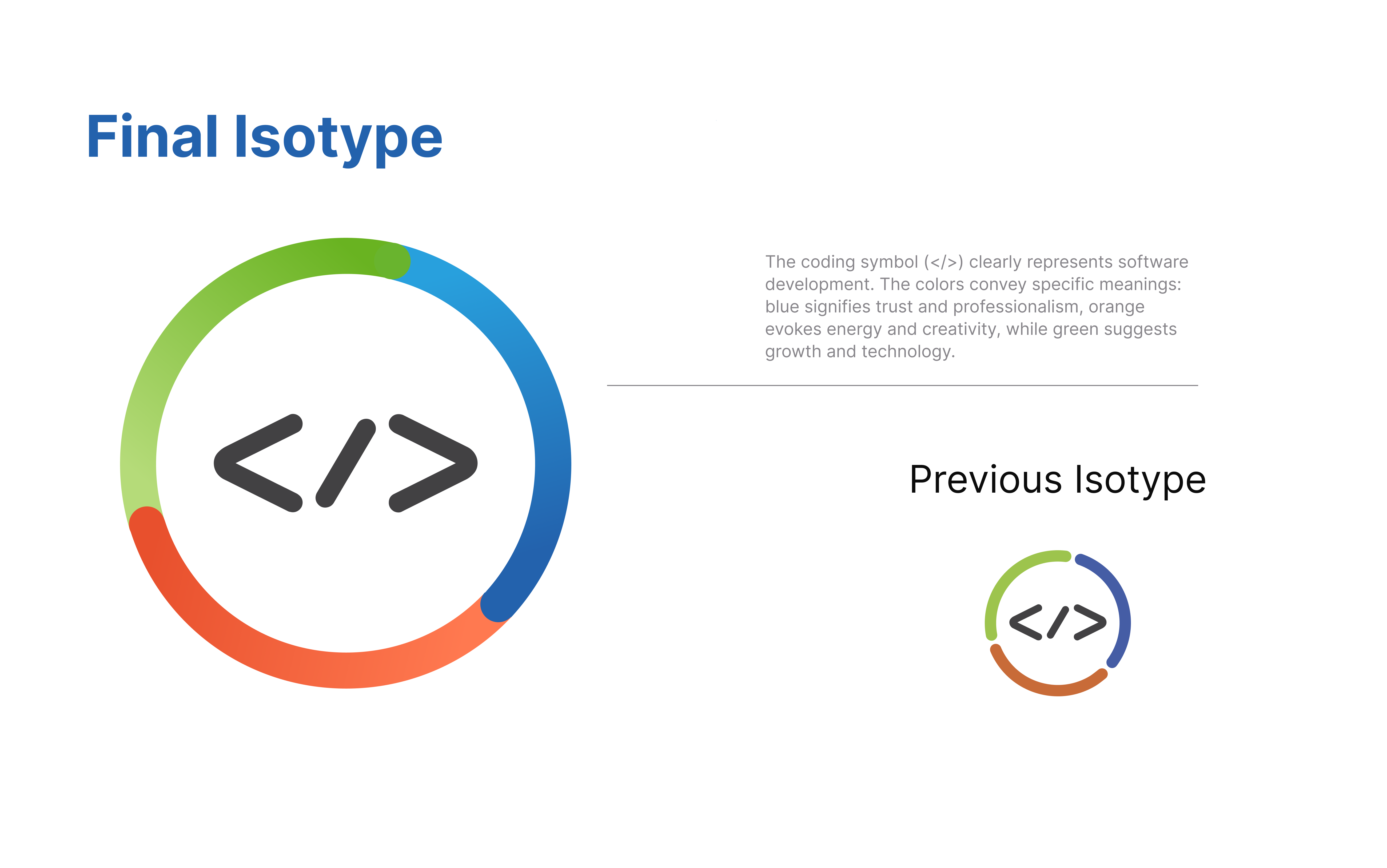
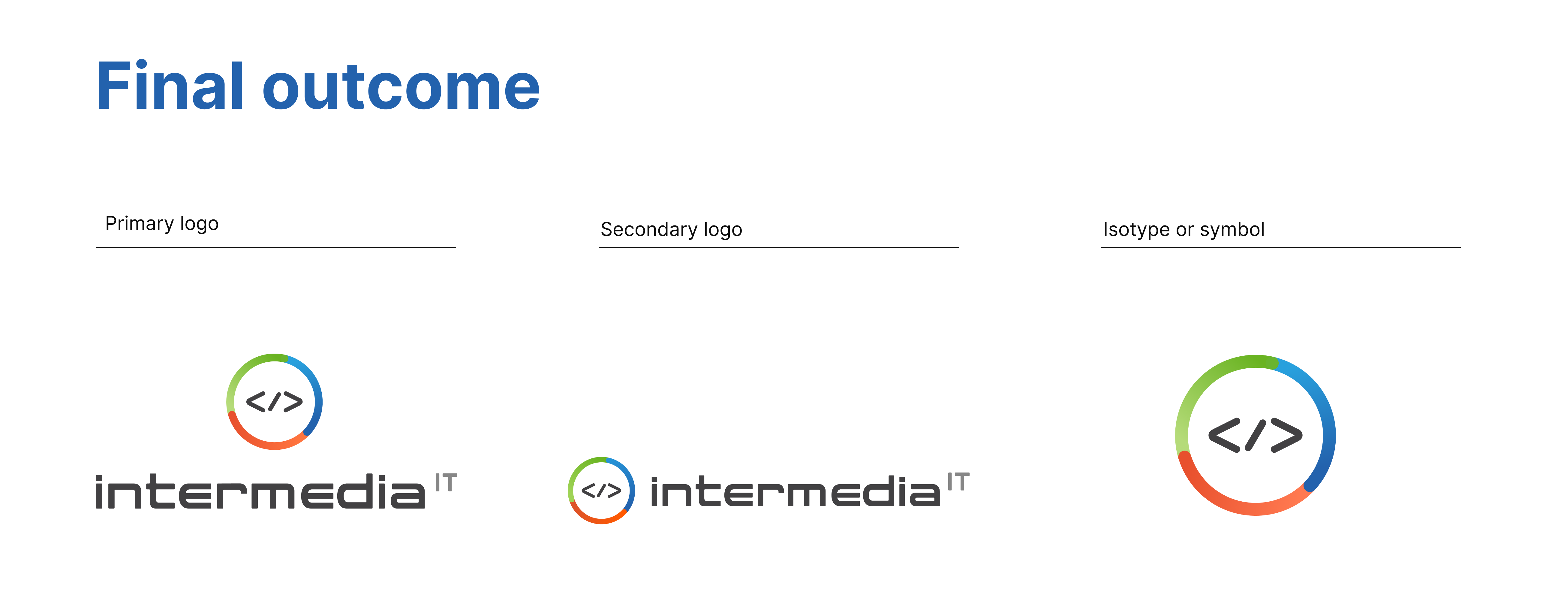
Proudly showcasing our talents! A dynamic team of design and communication, led by our Co-founder Guillermo Pomeranz, has charted the course for the progress of Intermedia IT's visual identity. This rebranding not only mirrors the company's evolution but also highlights the distinctive vision and problem-solving prowess of our professionals. The Intermedia IT logo is intricately woven into the fabric of the company's identity, boasting a rich history of over 10 years in software development. Founded and steered by passionate professionals, the brand positions itself as innovative, modern, and at the forefront of technology. The rounded sans-serif typography reinforces these ideals, while the vibrant color palette, featuring greens, blues, and oranges, aims to create contrast, impact, and visual distinctiveness. The decision to embark on this change stems from the necessity of modernization, updating, and adapting to new technologies and/or services.
Revitalizing identity: Intermedia IT's journey to modernization and tech excellence.
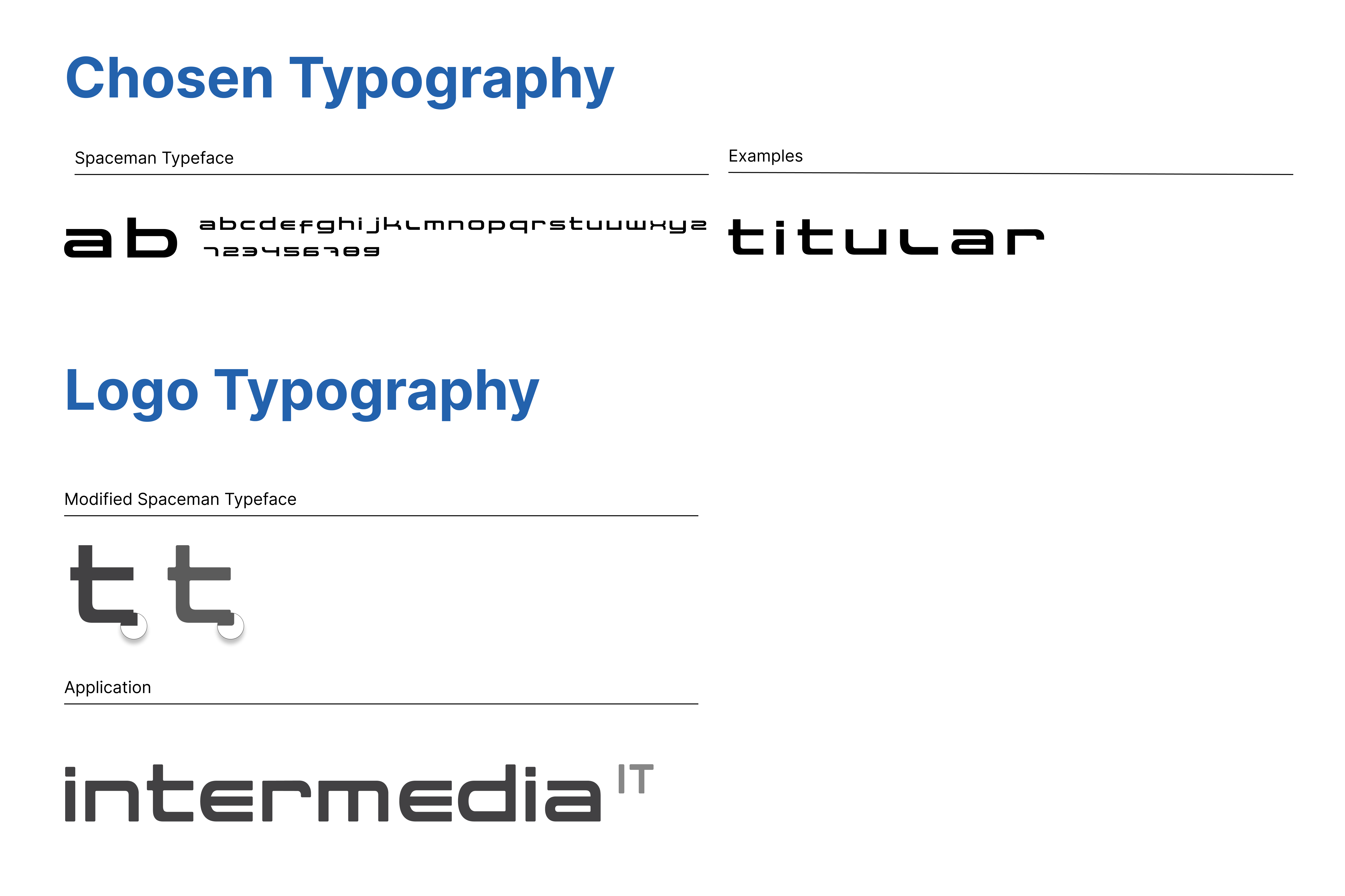
In an ever-evolving technological landscape, staying ahead is imperative. Intermedia IT has taken a bold leap into the future with a new logo meticulously crafted to reflect the latest graphic trends and communicate the company's unwavering commitment to innovation and modernity. The Spaceman typeface family, a rounded sans-serif in both uppercase and lowercase, communicates a sense of modernity and technological sophistication. Its recommended usage extends to significant graphic pieces or corporate identity, as its association with the logo can enhance its prominence. With rounded endings, it offers versatility across various formats, making it ideal for headlines and calls to action. The choice to round the corners further strengthens the connection with the circular icon, contributing to the overall harmony of the logo.
Transformación visual, abrazando la innovación: La historia detrás del cambio transformador del logo de Intermedia IT.
This project took shape when Guillermo proposed a minor adjustment to our visual identity to align and harmonize Intermedia IT with our present identity as pioneers in technology and innovation. Irene Maiarú provides insight: "The new logo visually testifies to our capacity to evolve. We aimed not only to reflect our current identity but also to anticipate the future of technology." Melisa González adds, "Every aspect of our image was meticulously considered to convey the dynamism we sought. This change isn't merely aesthetic; it signifies our steadfast commitment to continuous innovation."
With a focus on expanding services and embracing new technologies, Intermedia IT celebrates not only its growth but also its ability to adapt to a dynamic and ever-changing digital landscape.